
Musely
0 → 1 Personalized AI Route Optimizer for Museum Lovers

ROLE
Product Designer, Prototyping Engineer, UX Strategy
TOOLKIT
Figma, Cursor, React, Netlify
TIMELINE
5 days, solo sprint
CONTEXT & PROBLEM
Museum fatigue is a huge UX problem.
Museum-goers have limited time and usually only subpar, analog guidance for navigating exhibits efficiently. The size and layout of museums can overwhelm visitors, causing them to miss exhibits they'd love and waste time zig-zagging back and forth. Musely is an AI-powered route optimizer that plans around your time, your ticket, your energy, and your preferences.

Before I touched information architecture, I talked to museum-goers to figure out what greivances they had with the current museum-navigating meta and looked into how possible competitors handled similar issues. These were the five main pains:
4 USER INTERVIEWS
COMPETITOR EVALUATION
5 PAIN POINTS

RESEARCH SUMMARY
Pains with a root cause: nobody designs for limited time and tired feet.
That led to two principles I held onto for every screen after this:
#1
REDUCE DECISIONS (BUT NOT OPTIONS)
#2
DESIGN FOR THE BODY & USE-ENVIRONMENT
PLANNING
Feature planning and IA
I sketched out a preliminary structure for the app's pages and mapped the happy path alongside two secondary flows (a detour to a bathroom and engaging with art) so the AI route could be informed by real, likely human behavior instead of assuming a straight line through the museum.


CREATING THE BRAND
Intentional branding, from scratch
Before any screen could feel cohesive, Musely needed a visual identity (I speak more on what I learned about this later). I chose bright, "fresh" tones calming enough not to add to museum fatigue and paired it with a charcoal base that keeps the brand feeling transparent and implies that decisions are made easy. I also designed globalizing button and type styles early so that UI-design decisions could be streamlined through the rest of my process.

ITERATING
Designing for accesibility and polish
After deciding on the app's main features and flows, I started with low-fidelity mockups and a Figma prototype to stress-test the user flow before touching visual polish. The first pass had problems that included inconsistent color and type choices, low contrast, a nonsensical grid, and unnecessary visual elements that became visual clutter and exacerbated decision fatigue:

While my version-2 improved on some initial design flaws, I knew I still had work to do on spacing, typographic hierarchy, and ease-of-access to certain features.
I continued to iterate on both the visual polish and connections between screens until usability testing proved the prototype functional and easy enough to use in a hypothetically fast-paced, distraction-filled environment.
REACT PROTOTYPE
Simulating the experience
I used my knowledge of HTML, CSS, and JavaScript to create a React prototype and leveraged Cursor as a tool to accelerate the process. While the AI-logic here is a simulated “Wizard-of-Oz” prototype, creating a front-end allowed me to test the user flow’s logic and helped me pinpoint any difficulties or discrepancies that may occur when trying to develop from my static designs, which I went back and iterated further on. In this simulation, I prioritized function over pixel-perfect visuals.
Play with prototype →
View full video →
KEY FEATURES
Introducing Musely: A personalized AI Museum Route Optimizer!

Discover
Based on user’s personal preferences and current location, a real-time array of exhibits and nearby museums will be displayed on this “home page”.

Interests
To keep personalization accurate, users can update their interests and preferences through an easily-accessible screen from their profile.

Plan your visit
After selecting a museum to visit from the Discover Page, this screen allows the user to select or enter the amount of time they wish to spend there, add their ticket tier to verify available exhibits, and view or edit their custom AI-optimized route with time estimates.
Active Route
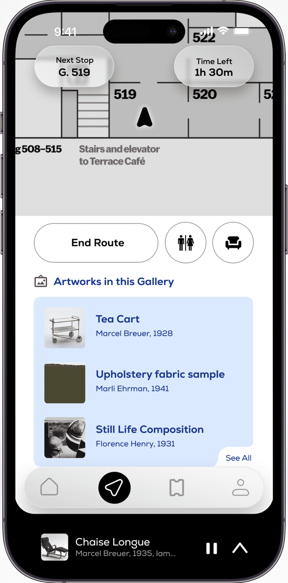
Upon tapping “Start Route”, users will be brought to a screen featuring their live location in the museum, information about their next stop and the amount of time they have left to make each visit, options to be route to bathrooms or seating areas, and information about each artwork in the current gallery.

Audio guide
Swiping up on the player bar will bring up more details about the current artwork and a transcription of the audio for users who are hard-of-hearing. Users can also save an artwork to their favorites or scrub through the audio.

Visit recap
When a user completes their route, they will be prompted to give feedback or view a summary of their visit.

Profile
The profile screen acts as an intuitive, easily-manageable archive of the user’s past visits, preferences, and favorites.
RETROSPECTIVE
What I learned
Static Figma ≠ functional.
Through coding the front-end of my app, I discovered the trade-offs required when translating static Figma designs to a functional interface. I gained an understanding of developer empathy and I realized the importance of beginning my design process while keeping technical feasibility in the back of my mind.
Brand before screens
A cohesive high-fidelity UI is impossible without a real visual language established early. When I started this project, I jumping in at full speed due to the time constraints of the sprint, so my first UI pass felt like an amalgamation of isolated ideas rather than one that followed a system.
Thinking in systems
The fast-paced nature of this project forced me to rely more on systems for efficiency. Auto-layout forced me to think in systems rather than one-off screens. Components had to resize and reflow properly and every choice had to hold up across states, which pushed me toward a more scalable design system earlier than I would have otherwise.
The ceiling of solo
This project taught me how to manage my own process but it also showed me that solo work can hit a ceiling. I’m looking forward to more collaborative work going forward: seeing how engineers think and getting sharper at sharing and challenging ideas with other designers instead of just my own so that we can learn from each other.
WHAT I’D IMPROVE
Next Steps
This was a self-directed design sprint, where I worked independently for a period of 5 days from concept to execution. I chose this methodology to challenge myself and not only learn more about interaction design but also learn about how to manage my workflow and how to handle challenges.
My long term goal is to evolve this project from a simulated experience to a live app. I plan to explore machine learning fundamentals to understand how to actually train algorithms to interpret preferences.
I also hope to:
Expand the scope of the app from being just for art museums to all kinds of institutions.
Refine design system components--for example--narrowing down button variants to create a more intuitive user experience.
Add features such as:
“Group Visit” mode to sync preferences and generate one optimal route for multiple people
Inclusive design features like accessibility toggles for elevators
Tiered audio-guide marketplace options
© 2026 KATIE PAN