Footnote
0 → 1 Location-Based Anonymous Storytelling App for Fostering Community
ROLE
Lead UX Designer — IA, flows, feature rationale, UI
TEAM
2 UX Designers
TIMELINE
1 day ~33 hours
(Protothon 2026)
CONTEXT, RESEARCH, & PLANNING
The spark
Footnote didn't actually start as a Protothon submission. It started as a class project I cared about: an anonymous app for pinning stories to the places they happened, built around the idea that grief, joy, and everything in between deserve a place to be honored and heard.
Before Protothon 2026 revealed the five tracks’ prompts, my team had actually planned to build something for the Travel track. But after reading through each prompt, I realized the Mental Wellbeing track described a project I built while learning how to use Figma. We pivoted and worked with the original idea, spending the next day rebuilding it and picking it apart to answer the brief.

↓
The brief
Protothon's Mental Well Being track asked teams to design a mobile app for sharing personal stories anonymously or openly, modeled after projects like Humans of New York, but solving the problem those projects didn’t. For example, Humans of New York only cover one city. Billions of people have stories worth hearing who'll never be approached simply because they don't live in New York.
The brief was specific about what this couldn't be, too: not a platform for debate, not built around follower counts, not something that turns vulnerability into content, not make users feel like they’re filling out a form. Every design decision was supposed to actively work against the patterns that make social platforms feel unsafe to be honest on.
CRITERIA:
Empathy over judgment
Not feeling like a stranger
Easing the blank-page
Anon or unknown - your choice
Not filling out a form
Finding similar stories
Global reach beyond language
Growing the community
What we were designing against
Digital platforms often optimize for transactional metrics like comments, likes, and follower counts, which all have a cost. Our research on emotional numbing and confirmed that repeated exposure to numbers-driven interactions dulls the amygdala’s neurological response over time, while platforms lean into it further because that content gets more engagement (regardless of if people search for it).
Separately, research on loneliness has found that perceiving other people as unfriendly online can make people withdraw further, exacerbating the isolation they were trying to escape in the first place.
Three pain points came out of combining that research with the prompt:

Talking to actual people, fast
We didn't have time for a formal research phase, so research became three unscripted phone calls before finalizing features and designs: two friends around our age, and my brother (a senior UX designer who I called mostly to sanity-check the concept from a design lens).
One conversation flagged that our original color palette read more "fun dating app" than "mental health” which is what pushed us toward a grounded, earthy green.
We also ran an informal usability-test on the prototype. Our tester clicked through with no explanation to test whether she could figure out what the app was for and how core actions worked:
“
I appreciate that it feels like something I'd actually use to vent to others safely. I think other apps lean towards feeling like therapy.
“
(PARAPHRASED FROM A PHONE INTERVIEW)
Working feverishly...
I participated in this thon running a 102° fever, having landed back in the US from my study-abroad semester the morning the event started. It wasn't a great 33 hours to be jetlagged and sick, but I was reworking a project I actually cared about with one of my closest friends, who is someone I already knew how to communicate effectively and efficiently with. Despite the discomfort I looked forward to opening the design file and making something we could be proud of.


fever 102... deadline soon...
good thing i love this project
#worth
RATIONALE
From class project to finished product
→

Original version
Poster chose own emotion tag
Public likes, comments, follower-style feed
One city / one region of pins
Open-ended "What happened here?"
Purple, softer/rounder visual language
N/A
N/A
Reworked version
Readers tag entries with how the story made them feel
None of that!
"See Similar" AI surfaces stories with a similar feeling from other parts of the world after you post
Added a dismissible daily prompt above the open canvas
Earthy green palette, hand-drawn mark to humanize
Private notes, voice memos, and doodles sent straight to the author
AI moderation layer that flags harmful language and suggests softer alternatives in real time
Pain Point
#1
#1
#2
#3
-
#1
#1 & #3
.
replaces self-scoring with being understood by someone else
removes the incentive to perform
the actual worldwide-connection mechanic the brief specified
gives people a way in without forcing a rigid structure on everyone
based on user feeback
lets people respond with warmth without turning it into a public thread
minimizes "banal toxicity" making people perceive strangers as unfriendly
SOLUTION
Introducing Footnote: a location-based emotional and social wellbeing platform
Onboarding
Begins with a location notice informing that Footnote never uses precise location. This isn’t just to get the location perm: trust has to be established before vulnerability is.
The app also generates a random, anon display name (like "Cerulean Iguana") that users can change right then or later if they want to be less anonymous.
Posting your story
The composer has a daily, dismissible prompt so those who have something specific to say aren't slowed down while those who don't know where to start have somewhere to begin.
As you type, the AI-moderation layer kicks in. It doesn't bar you from saying what you need to but instead flags language that could tip toward harm and suggests gentler alternatives to steer interactions away from the toxicity.
The only decision left to make is whether to post anonymously or under your generated name.
No scoreboard
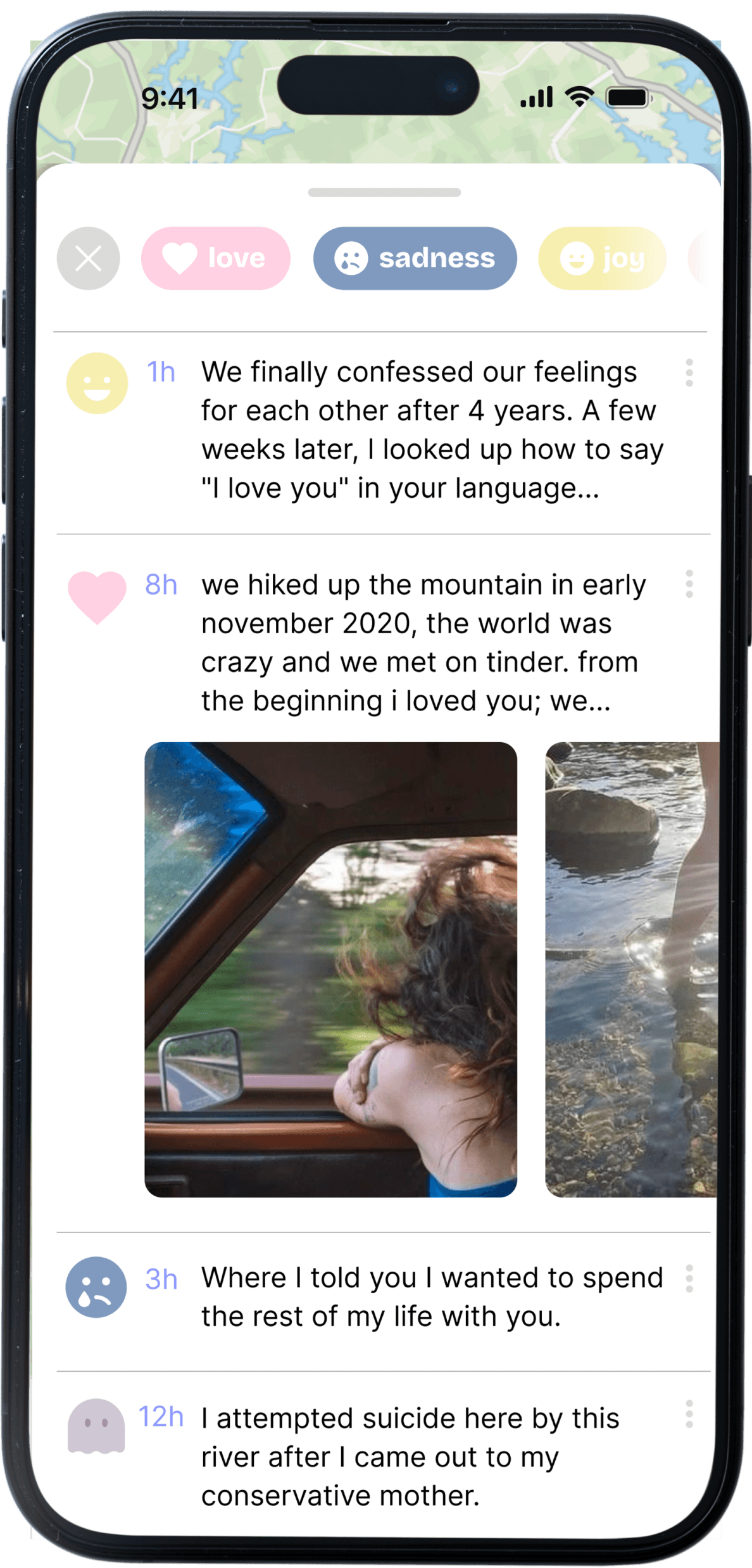
Footnote has no followers, doesnt number engagement, and has no public comment threads. Instead, readers tag entries with how the story made them feel, and comments are replaced with directly reaching out to the author.
Readers (as opposed to posters) assigning a feeling is deliberate. It means being seen isn't something you have to perform or caption correctly. Someone else has to actually read your story and recognize themselves in it.
Worldwide connection
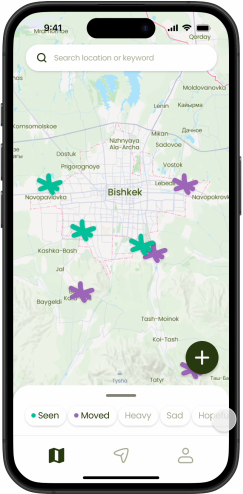
Every story is pinned to the place it happened and visible to anyone.
After you post, AI matches emotional resonance and surfaces stories from people somewhere else in the world who felt something similar, so a story from Bishkek can reach someone in Berlin.
Direct interactions
Notes, voice messages, and doodles all replace a public comment section. These are all still passed through the same moderation layer before they reach the author, so people still feel safe.
CONCLUSION
What’s next?
Three features we scoped for a v3, but didn't have the time to build:
“Take me somewhere else”
An option that randomly drops the user’s view to a different part of the world, increasing the sense of worldwide connection.
Archiving old pins
Old story pins will be archived in a year so that the map surfaces new stories (and honors the practice of “moving on”).
“Nearby” push notifications
When a user walks by a location where a story was recently posted, they’ll get a notification, imbuing more emotion into everyday living.
Retrospective
Don’t let “non-ideal” conditions stop you.
I built this sick and jetlagged, and the version of Footnote that came out of that is something I’m proud of. I'd rather show that I can work through friction and create something I love than give up in fear that I might make something that isn’t “perfect”.
Reworking something can be hard, but worth it.
It might’ve been easier to build a new concept with no “old quirks” to smooth out than to take something I care about and interrogate every decision in it against a brief I didn't write. But I do believe that extra attention is what made the final version better than a rushed original idea would've been alone.
Good partnership shows up as trust.
My teammate and I didn't split this cleanly into halves before beginning work. Clear division of labor certainly has its place, but the short timeframe on this project and our understanding of each other’s communication and work styles made our teamwork on research, UI, and reasoning a breeze. Trust, understanding, and empathy goes a long way.


© 2026 KATIE PAN